Fintech · Product design · Responsive web · UX research
SoFi Relay Credit Score Tracking
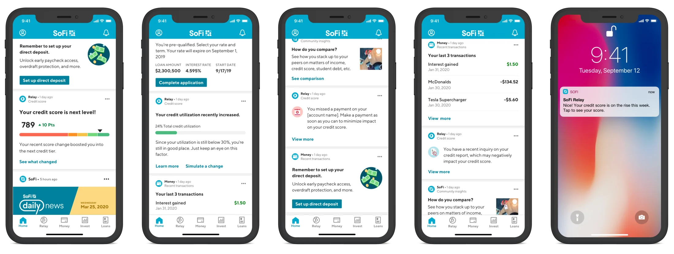
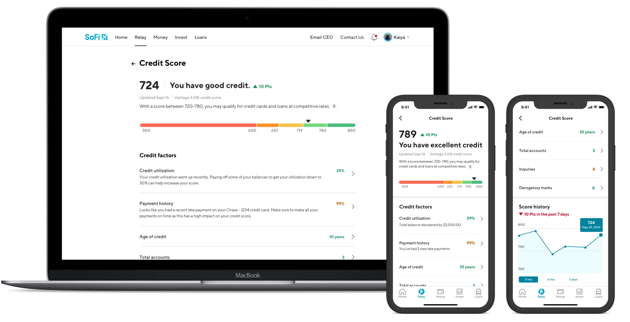
SoFi Relay is a product that makes it easy to know where you stand, what you spend, and how to hit your financial goals — all in one app. In December 2019 we launched a new feature so members could track their credit scores at no cost, with weekly updates to stay on top of score changes. It took off almost immediately with little-to-no marketing spend, surpassing 100,000 sign-ups by March 2020. This feature is still alive and kicking in the SoFi mobile app today, with minimal design changes since our launch.
Business impact
Design goal
SoFi's mission is to help members reach financial independence. We already offered low-rate loans, investment accounts, cash management, and spending insights — but credit score tracking was not something we had offered until then.
A person's credit score is a key piece of their overall financial health, with a large impact on what accounts, credit cards, and loan terms they're eligible for. Yet many people don't fully understand what affects their score or how to improve it. We set out to build a fully transparent, educational, empowering, and free tool that would be accessible to absolutely anyone — existing SoFi customer or not.
Defining key user flows and pages
My design process started by working closely with my engineering partners to understand the data available and the technical realities of the credit check process. We received credit report data through a credit bureau API, but the raw data was complex and inconsistent.
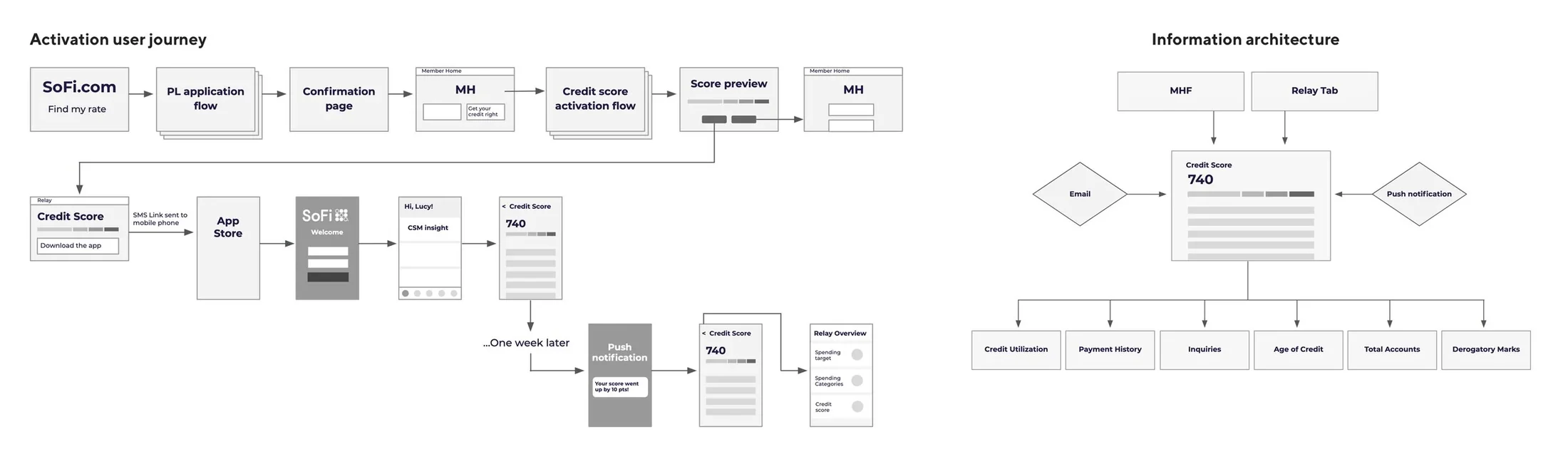
Through iterative analysis and sketching, we defined an overarching framework to display the credit factors and report data in a more intuitive, user-friendly way. From there we defined the steps of the sign-up flow and how the key feature pages would fit into the overall app.
Visualizing credit health
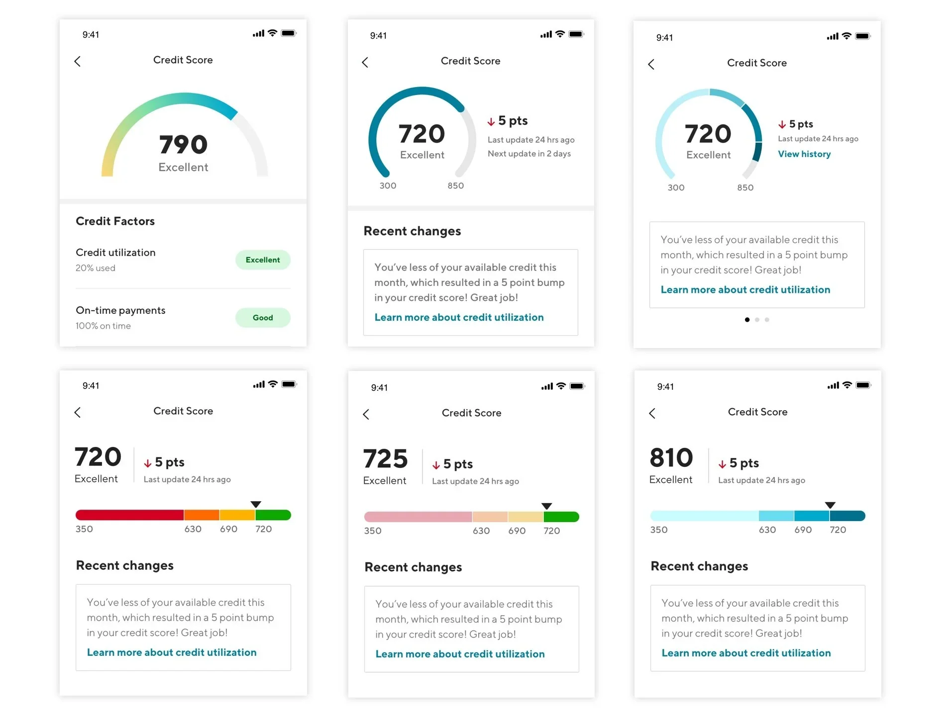
As the main visual element on the credit score dashboard, I wanted the data visualization to give users a simple and intuitive framework for understanding their score. I explored two basic shapes for the meter — a crescent and a bar — and ultimately chose the bar, since it yielded a cleaner, more consistent layout across screen and device sizes.
Color usability tests
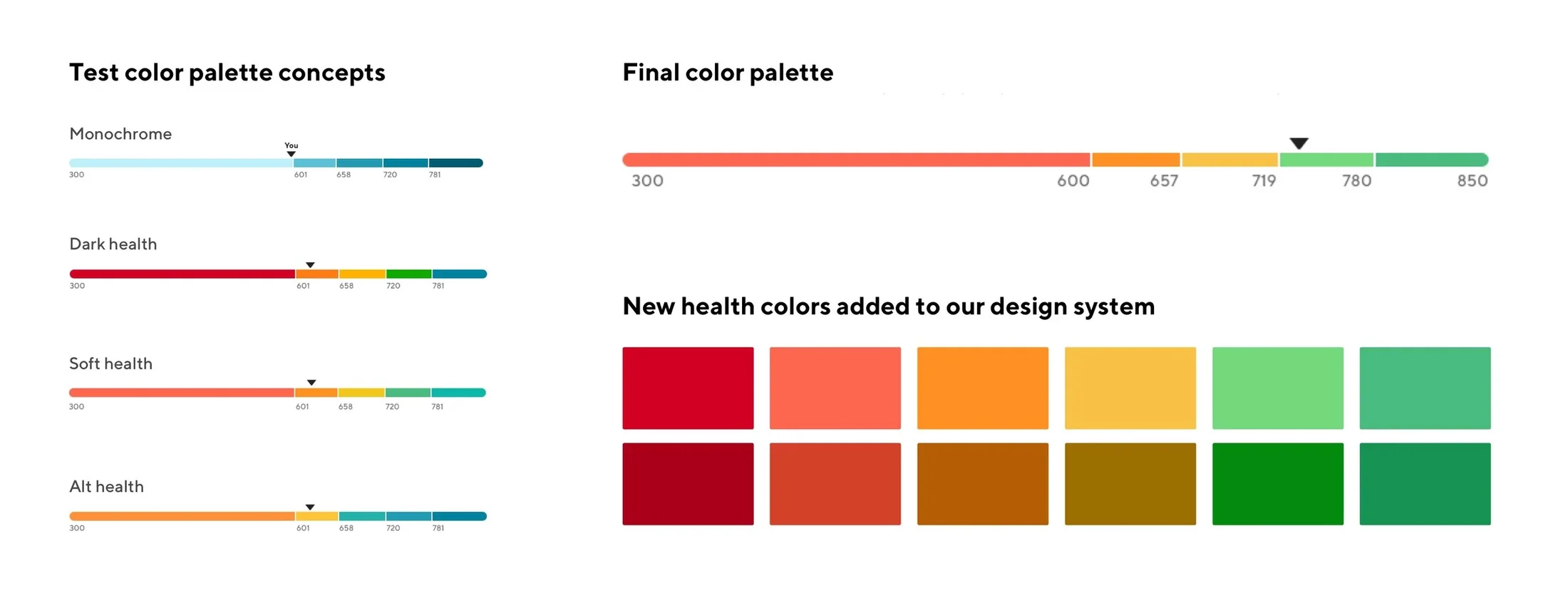
At the start of this project our design system's color palette was extremely limited — only dark red, green, and various shades of ocean, our primary UI color. During early explorations I wasn't satisfied with the available options: they felt either too harsh or too bland. I proposed adding a new spectrum of health colors to our design systems team and volunteered to lead the exploration.
To understand the emotional and functional impact of color in the experience, I ran usability testing on four possible palette directions. Users clearly preferred the softer, more modern "rainbow" health spectrum, describing it as the friendliest and easiest to understand — something that wouldn't make them feel alarmed or judged if they were "in the red."
In the end we not only identified a set of colors suited to our product needs, but as a secondary win added a new secondary palette to the design system that could be leveraged across all products.
Sign-up flow
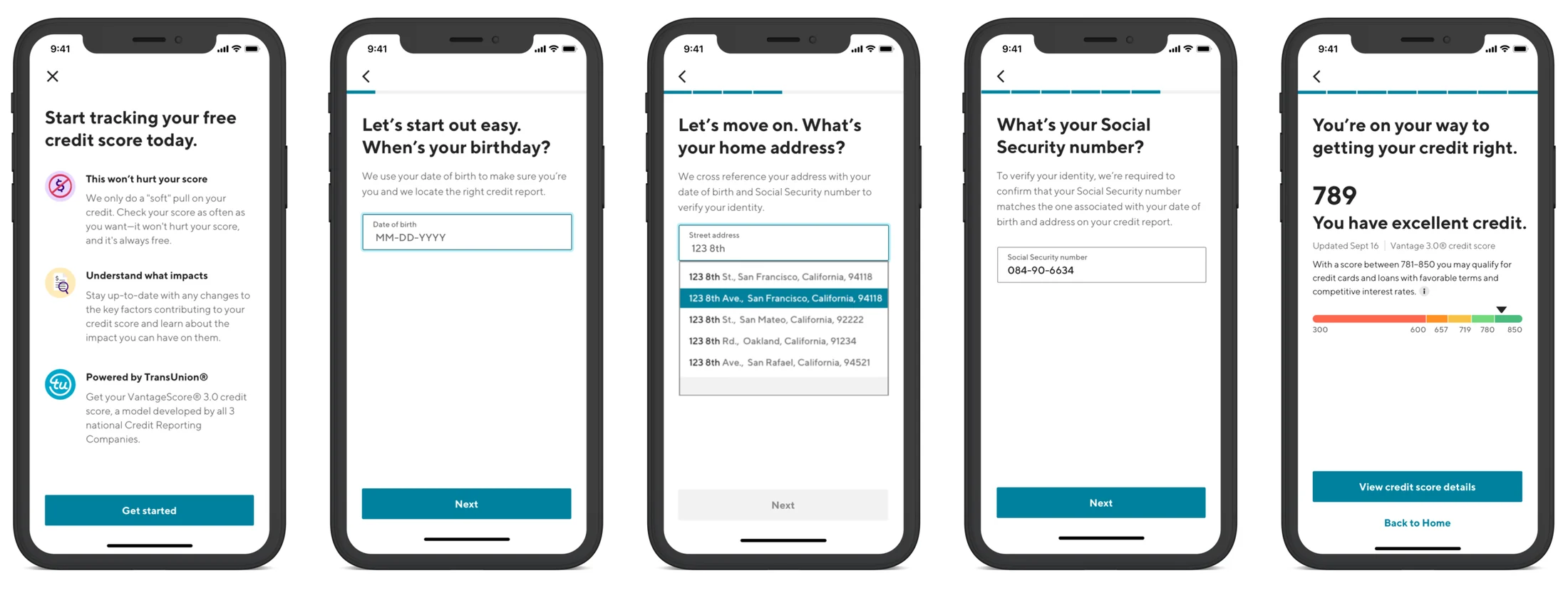
The steps of the sign-up were largely predetermined by the credit bureau API and the information required to generate the report. But we employed a few key principles to make the flow feel as quick, easy, and trustworthy as possible.
Even though it meant adding an "extra" step, we opened with an educational page to set expectations and reinforce the value props. Then we asked a series of personal questions, starting with the lower-stakes ones to build trust and waiting until the last step to ask for a Social Security number. At each step where we asked for personal data, we explained exactly why we needed it and what the user would get in return. Finally we ended with a preview of their score for immediate gratification.
Credit factor pages
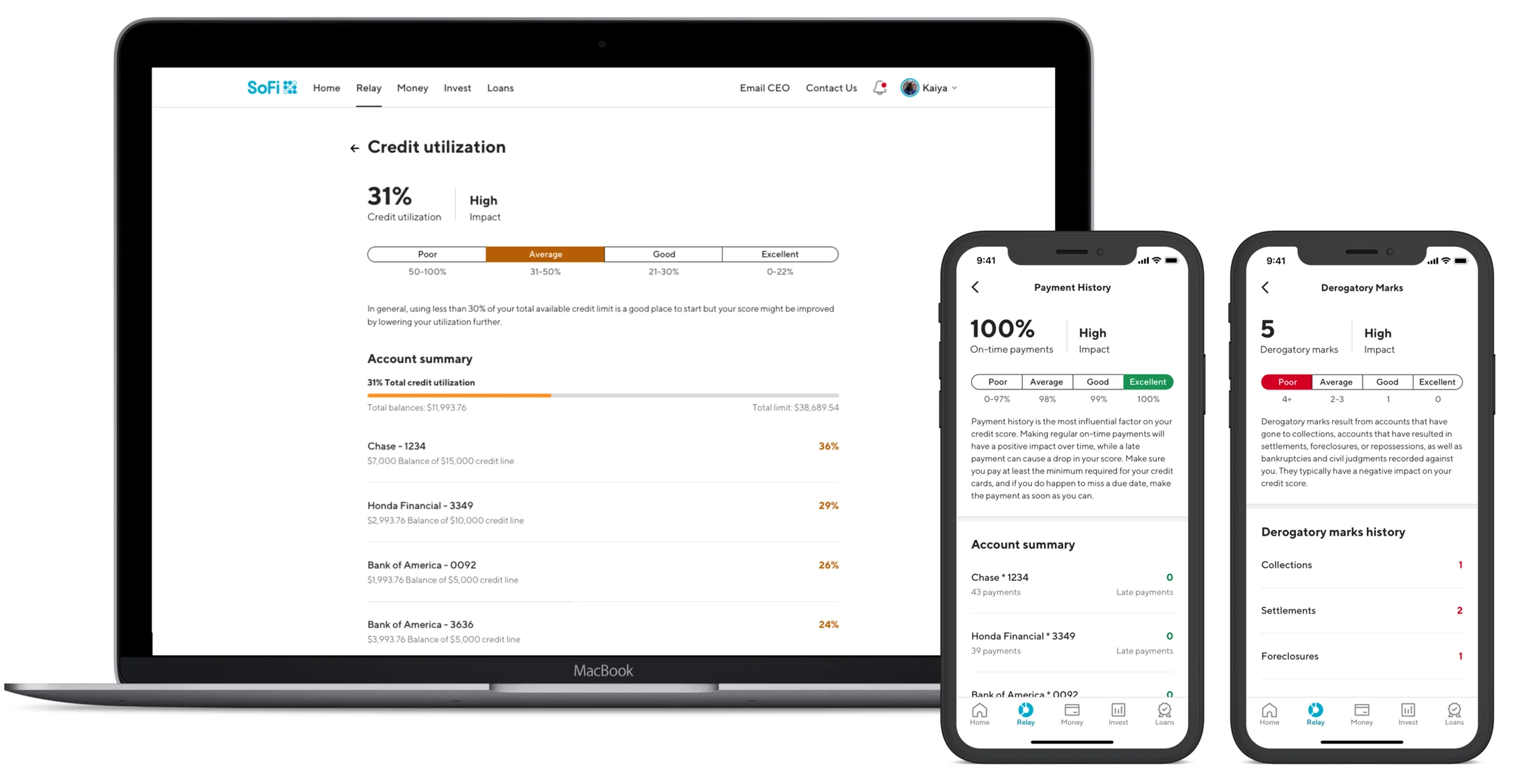
Branching off the main dashboard, we added a detail page for each of the primary credit factors that make up a user's score: payment history, credit utilization, age of credit, total accounts, credit inquiries, and derogatory marks. Each page gave a full breakdown of how the user was doing in that category, with a focus on educating them on the factor's impact and how to improve.
Communicating credit tiers
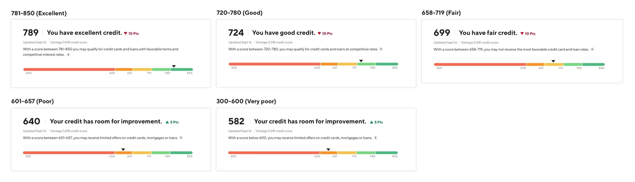
In the Vantage 3.0 credit model, scores range from 300–850 across five tiers, described as Excellent, Good, Fair, Poor, and Very poor. Since our target users were people trying to improve their scores, I felt strongly about striking the right balance between informing and motivating.
Just as I wanted to avoid shades of red that users perceived as judgmental, I wanted to avoid critical or demeaning language. The key information is the score itself and an accompanying description of how it affects access to financial products. We excluded the original "Poor" and "Very poor" labels in favor of a more encouraging "Your credit has room for improvement."
Messaging & engagement strategy
Working with the product manager and a content strategist, we created a messaging framework to send users ongoing credit score insights. Based on a weekly credit pull, we alert users not only when their score rises or falls, but also when their credit utilization changes, a payment is missed, a new account is opened in their name, an inquiry is made, or a derogatory mark appears.
The alerts span three channels — in-app, push, and email — and are friendly and educational. In our credit utilization messaging, for example, we coach users to pay down balances to get utilization under 25%, which in turn provides immediate score improvements. The engagement lift from this feature was in large part due to these regular, friendly nudges.