AGL Energy Digital Transformation
AGL Energy hired frog to re-envision their entire customer experience from a digital-first perspective. As the biggest energy provider in Australia, they had an admirable legacy but were struggling to maintain the brand due to customer service issues and a clunky, out-dated online experience. To re-build the digital experience from scratch, the frog team worked on site in Australia, embedded with the AGL team in a truly collaborative process. Working with the in-house team, we identified key moments in the customer journey that would be the foundation of the new digital experience, such as signing up for a new product or paying a bill. The goal was to make the experience feel more transparent, trust-worthy, valuable, and engaging.
Role: Senior Visual Designer
Team: I worked with a team of a Creative Director, 2 Interaction Designers, 1 other Senior Visual Designer, a Product Strategist, and an Engineering Lead.
Scope: Responsive website, new digital design language system, key design pages, interaction model definition, information architecture
New AGL Homepage
Customer Insights
Complex Billing
“I feel like I practically need a PhD just to understand my energy bill.”
— David, Melbourne
Unsorted/Missing Data
“Seeing energy patterns for my home helps me pick up on anomalies.”
— David, Bendingo
Low Brand Trust
“I don’t have just trust issues, I have value issues with them. What value does AGL provide to us?”
— Cathie & Paul, Bendingo
Co-Design Workshops
We held several collaborative co-design workshops with our AGL clients to gain better understanding of the product and prioritize the use cases and user flows for our work. We aligned on a decision to focus on the key moments of friction throughout the customer experience, such as choosing a product, understanding bills and energy usage, and trouble-shooting issues at home.
Key Customer Events
We identified 6 categories of the AGL experience that spanned the customer journey, these high- level events each contain online/offline service touch-points and different user flows throughout the digital experience.
Becoming a Customer
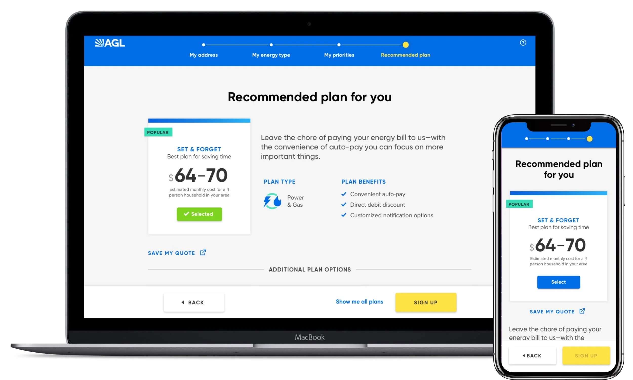
We simplified the product selection process and offered options for customers to both quickly see everything available or opt to get a customized quote in a more guided flow.
Understanding Usage & Charges
The logged-in customer dashboard depicts the primary data from upcoming bills while contextualizing the charges into relatable usage categories. We tried to make it as intuitive as possible, and challenged ourselves to never use the term “kilowatts.” The data visualizations are simple, bold, and appear to have a tangible vibrancy. We laid out the UI to allow for easy data comparison, between bills or times of day, as well as to highlight usage spikes.
Self-Service Tools
A new online help-center and mobile-friendly moving address tool gave customers the independence to solve their own problems, without having to phone an agent. By simplifying a previously complex process, we could reduce the emotional stress on customers.
Experience Principles
We defined a set of principles that guided the conceptual thinking as we went through the process of designing the user experience. These principles kept our values aligned as a team and ensured consistency in the tone and interactions of the final designs.
A New Design Language System
The design language expresses the new direction for AGL’s brand focus on energy-innovation while still feeling friendly and approachable for less tech-savvy customers. Our central visual themes were illumination and the balance between sharp precision and rounded curves used throughout. These visual metaphors extended to the typography, icons, UI components, photography, and interaction behaviors.


