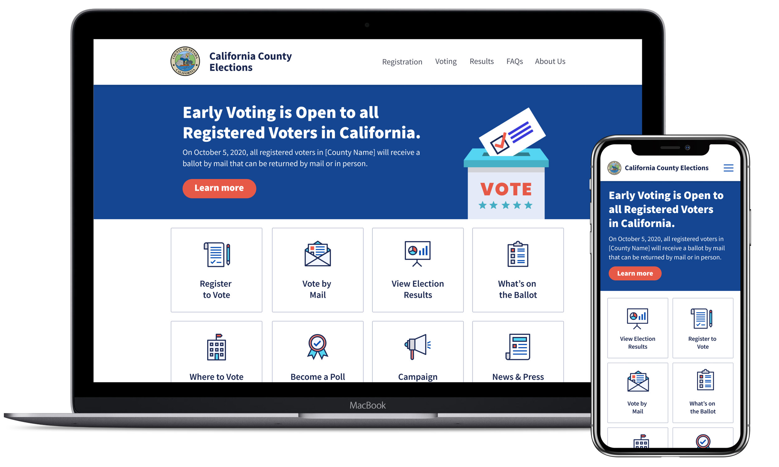
Local Elections Website Template
In partnership with the Center for Tech and Civic Life, U.S. Digital Response has created a simple, modern website template designed with both election offices and end users in mind.
My role: Lead UX/Visual Designer
Team: I worked with 2 software engineers as the core U.S. Digital Response design/development team, and we worked in closely with our partner organization, the Center for Tech and Civic Life, for input on the product, design, and content.
Scope: Responsive website template design (built on Wordpress), product strategy, information architecture, visual design system including elections-theme icon library, color theme options for template implementation, content strategy and UX writing, contribution to implementation guide.
Partner Testimonials
“Partnering with USDR on the election website template has allowed CTCL to work on a much faster project timeline. USDR are ideal project partners— they asked important questions to better understand the problems we're trying to solve, they listened to our ideas and understood our constraints, and they delivered a product that all of us are really proud of.”
— Whitney May, Director of Government Services, Center for Tech and Civic Life
"With the help of U.S. Digital Response, we were able to build a new elections website that will better inform our voters on what to expect when voting in November. We launched our new website within a week, and USDR provided support each step of the way. I highly recommend them if you need to scale up any tech quickly."
— Kammi Foote, County Clerk-Recorder & Registrar of Voters, Inyo County
The Problem
Many counties in the U.S., especially those that are smaller/under-resourced, have election websites with poor UX design and accessibility issues, or lack websites altogether. Several years ago, the Center for Tech and Life identified this as an urgent need—for election offices to have access to better tools to create user-friendly, accessible websites. These county-level elections office websites are a critical resource for election information and a key tool in our democracy.
When CTCL and USDR decided to partner on this project, they had an existing template they have created years ago on Google’s Blogger platform, and they knew it needed a full overhaul, including the technical platform and the UX/design of the website itself. Some of the key issues we defined were that the original template was not mobile-friendly, had significant accessibility issues, confusing information architecture, and a dated-looking aesthetic. We also had the goal to simplify the backend admin experience, to make it easier and faster for election officials to get their websites launched with little-to-no IT support.
Our Solution
This new template was a complete re-design with a key focus on a mobile-first UX, web accessibility (in accordance with WCAG), and an official, but approachable and clean design aesthetic. The approach to content organization and information architecture is based on years of research by the Center for Civic Design on how voters access information online, and it empowers counties to keep voters informed with up-to-date information, regardless of their device or accessibility needs.
We launched our first implementation of the new template in August 2020 with our pilot partner, Inyo County, CA, and have since launched 4 more sites and counting prior to the November 2020 election. Read even more about this active project on the U.S. Digital Response website.
Modular Template Design
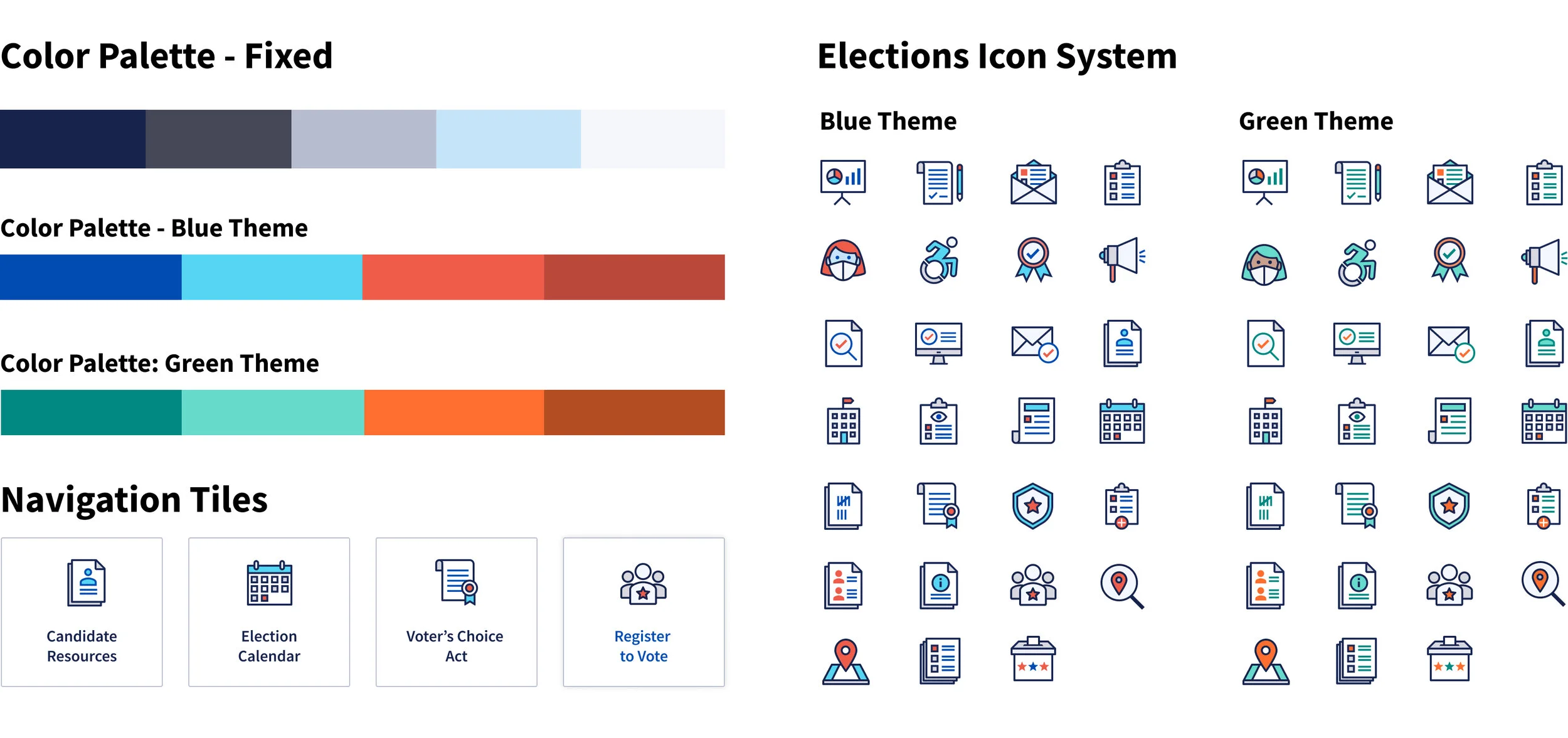
I knew that we needed to have a flexible, modular design system with components that could be used in various configurations to organize pages and content categories that differ by state and county. I created a simple tile navigation system with bold icons and labels; this created the main layout for the site homepage, but could be re-used throughout other pages to keep child pages and related content organized in an intuitive way for voters scanning for a specific topic. The Voting page was an example of where this tile navigation was re-used to organize a large about of information about voting methods and resources.
Additional Site Pages
The site template also included these example pages and components, including a simple table layout, an expandable FAQ design component, and an easy-to-use contact form on the About Us page that helped election officials better manage inbound voter communication and questions.
Design System
I created a design system that had a modern and friendly aesthetic, but felt also felt official, professional, and born-in-the-USA without going overboard with traditional red, white, and blue. In crafting the original color palette, I realized that putting a bit of extra effort to create two slightly different color themes would provide an extra level of customization that the different election offices desired. It was important to provide a lightweight way for the administrators to put their own stamp on their website, so we addressed that by providing the 2 color themes, a range of homepage banner backgrounds, and a set of homepage illustrations to choose from. I also created a library of election-themed icons to use in the site’s navigation tiles; the icons quickly became one of the most loved parts of the templates, and we found that counties wanted the entire downloadable set so they could use in print materials and other applications beyond the website itself.
Homepage Banners
In creating their website homepages, election officials have mix-and-match options by way of the 2 color themes and the different illustration options. This provided flexibility to help them communicate key information within their own state and county-specific use cases.
Press & Recognition
Shortly after we launched with our first 5 counties, our website template received recognition from the NY Times and Fast Company!
The NY Times described the site we launched Centre County, Pa. (which uses the template) as “an election information website that’s as easy to use as your favorite shopping site.” Read article
Fast Company described our project this way: “Local election jurisdictions are answering voters’ questions online through beautiful new websites based on a simple WordPress template developed by U.S. Digital Response in partnership with the Center on Tech and Civic Life and the Center for Civic Design.” Read article


